The First Five Seconds: What People Notice When They Walk Into Your Store
A welcoming store entrance gives customers room to arrive, a clear route to follow, and flooring that works in real conditions. Here’s where I’d start.
October 1, 2026
·
7 min
You’ve chosen the window display, adjusted the lighting, and spent an unreasonable amount of time deciding which shade of off-white says “effortlessly sophisticated.”
Then someone opens the door and walks straight into the back of a clothing rack.
Well. That’s an introduction.
A store’s first few seconds tell customers quite a lot. Can I move comfortably? Where should I go? Does this place feel looked after? Am I welcome to browse, or have I accidentally interrupted something?
I’m not suggesting everyone makes a purchasing decision in precisely five seconds. But those first steps deserve attention, especially in a small store where the entrance, merchandise, queue, and staff are all sharing very limited real estate.
Your welcome starts before anyone says hello.
What Do Customers Notice When They Enter a Store?
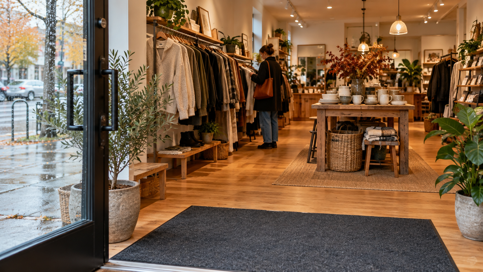
Customers encounter the entrance as a whole: the light, the sound, the state of the floor, the space around them, and the people already using it.
A useful entrance gives them somewhere to arrive, a clear view into the store, and an obvious way forward. It also handles the practical things customers bring inside, including wet shoes, umbrellas, shopping bags, and strollers.
That applies as much to a neighbourhood shop in New Westminster as it does to a boutique in Vancouver. You don’t need a grand entrance. You need one that works.
Give People Somewhere to Arrive
Opening a door is a small task. Opening it while holding a coffee, folding an umbrella, and keeping a toddler pointed in approximately the right direction is a production.
Now imagine doing all of that beside a table of breakable ceramics.
I’d give customers a little breathing room before asking them to engage with the merchandise. They should be able to clear the door, adjust to the space, and decide where to head without blocking the next person.
In a small shop, that may mean moving one display rather than redesigning the entire floor plan. Check what happens when the door swings open, when two people enter together, and when somebody leaving meets somebody coming in.
A display can be beautifully arranged and still be in the wrong place.
Your Floor Is Part of the Introduction
Retailers are very good at asking customers to look up. Look at the sign. Look at the display. Look at this lovely thing you didn’t know you needed.
But a wet or awkward entrance sends their attention straight down.
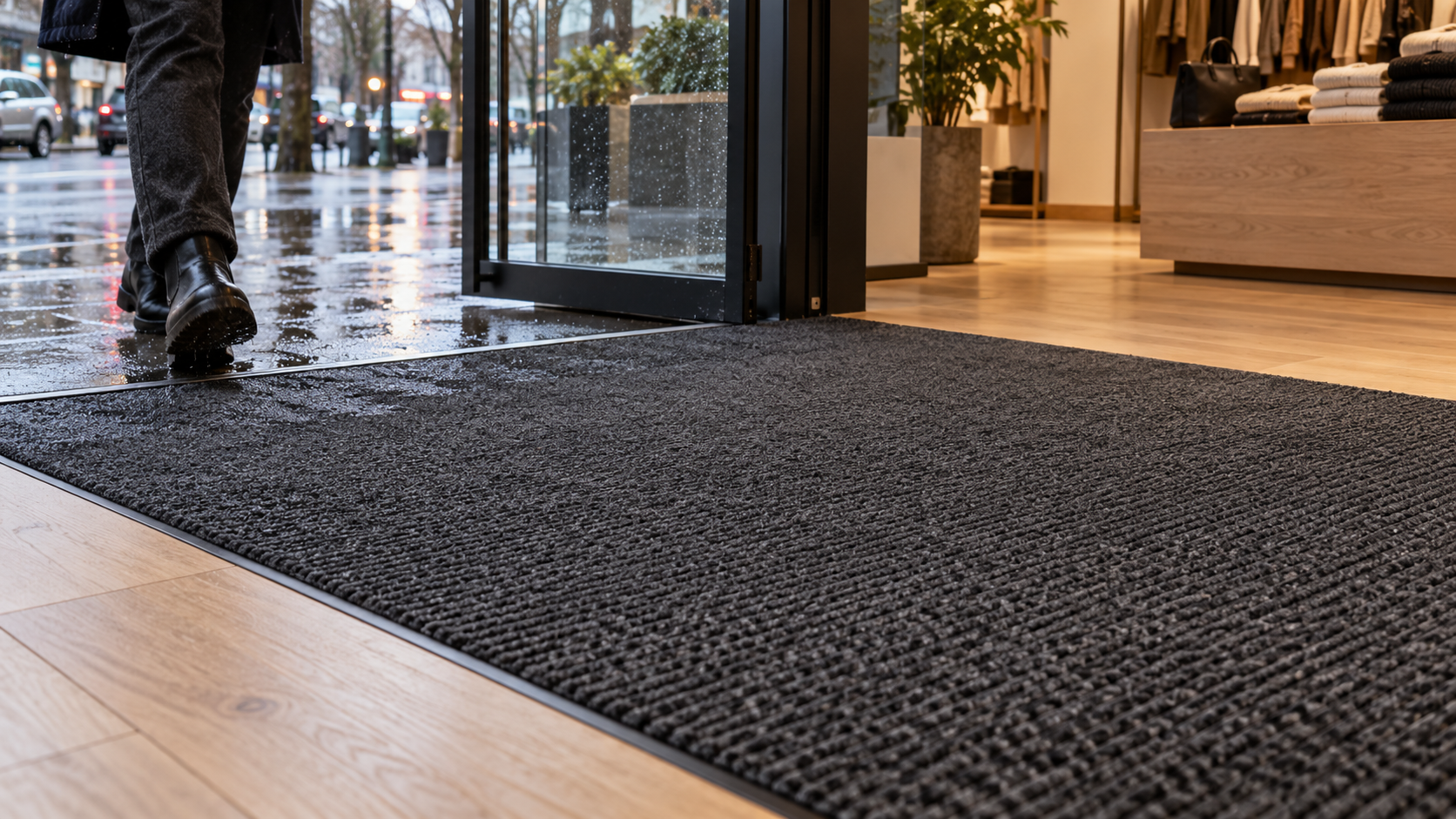
A mat pushed sideways by the door, a curled corner, or a visible trail of muddy footprints tells a different story from the window display. Suddenly the customer is working out where to step.
Entrance matting should suit the actual doorway and walking route, sit securely, and allow the door to operate properly. It needs enough coverage to do useful work before people reach the finished floor. One damp footprint on a tiny mat followed by several on the tile is a fairly clear performance review.
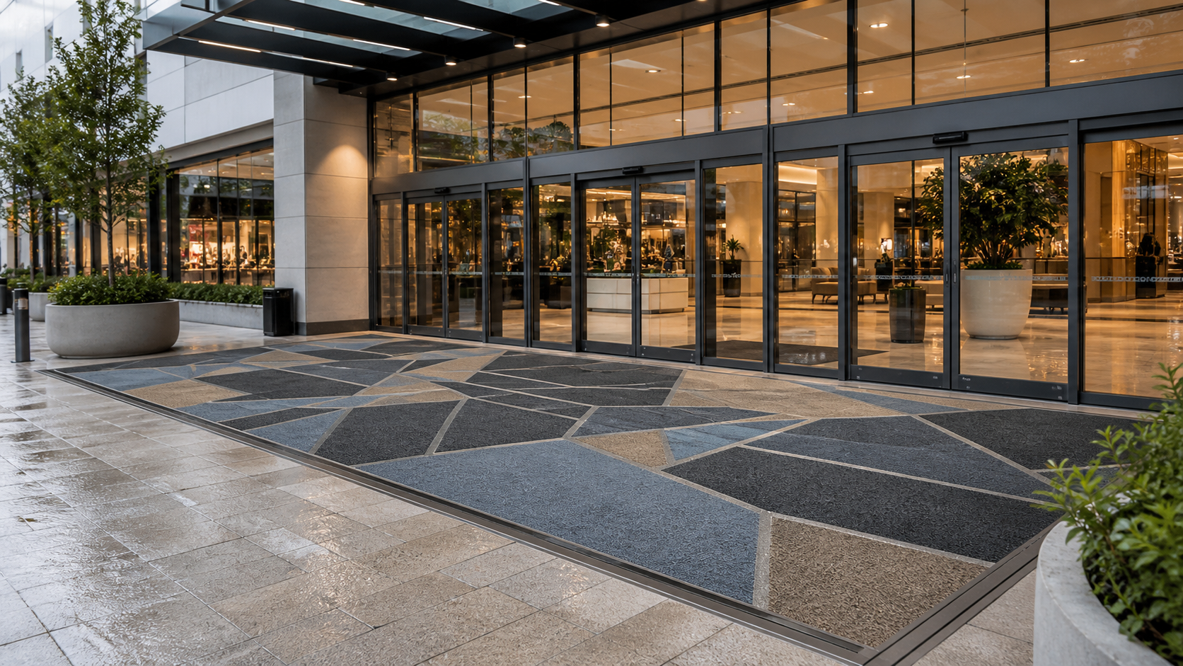
For a street-facing shop, consider how you’ll handle rain and grit. For a store inside a shopping centre, look at what reaches your entrance from the shared concourse. The conditions differ, and the solution should too.
Include cleaning in that decision. A beautiful mat that staff cannot maintain conveniently will struggle to stay beautiful.
Can People Tell Where to Go?
There’s a particular kind of shop where you enter, stop, and perform a little sideways shuffle while trying to understand the layout.
Is that the queue? Can I walk behind that table? Is the person standing there browsing or waiting to pay?
Nobody should need a floor-plan briefing to buy a jumper.
Clear sightlines and an open route help customers understand the space. Keep the main path easy to distinguish from displays, and make sure the checkout queue doesn’t quietly take possession of it.
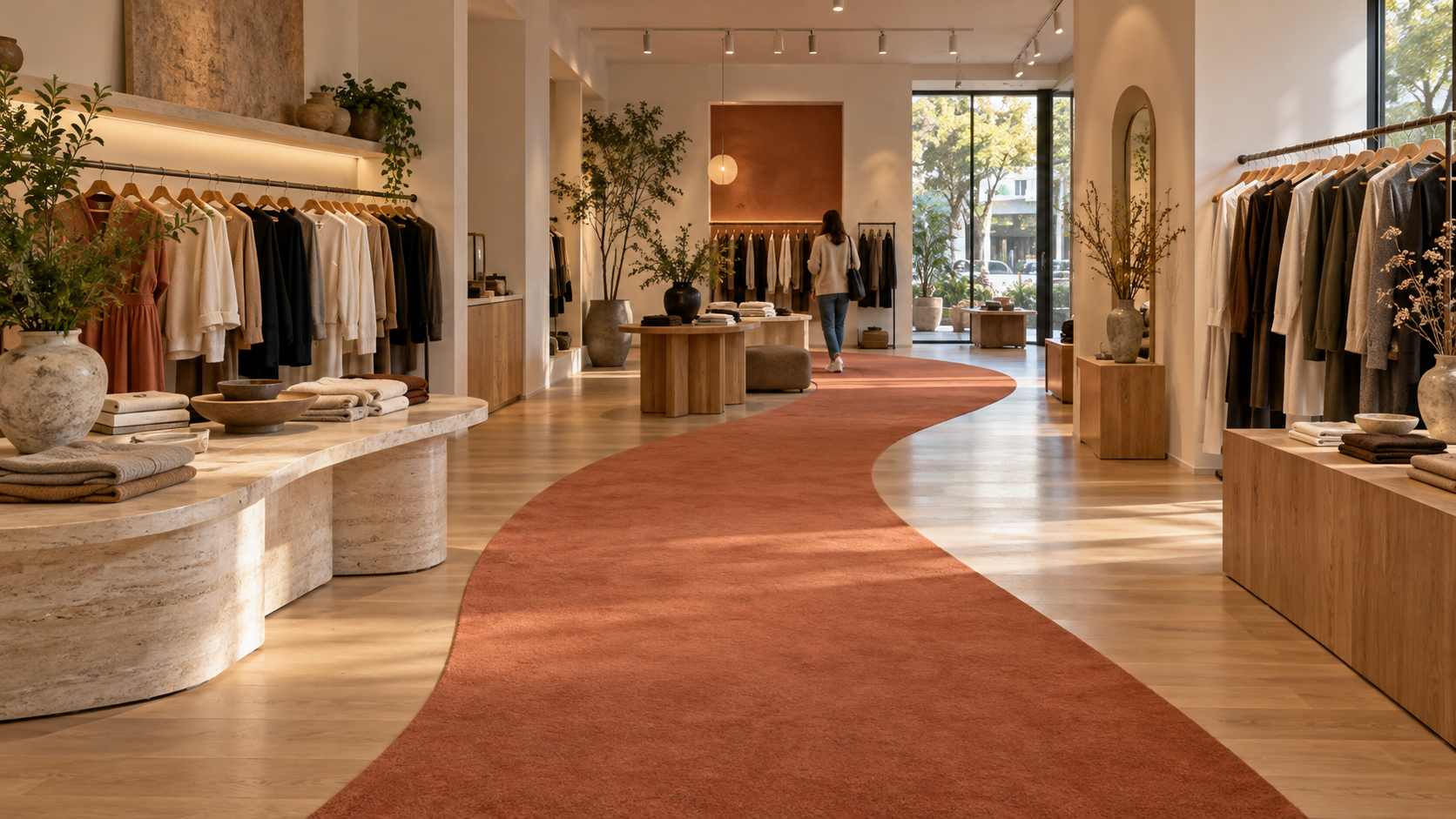
Flooring can help with that. A change in colour or material can suggest a browsing area, while a carefully planned carpet route can lead people further into a store.
Imagine a continuous carpet path gently weaving through the merchandise: a small retail version of the Yellow Brick Road, with fewer flying monkeys and better knitwear.
That’s a design possibility worth exploring, provided it works with the layout. The route still needs suitable materials, secure edges, smooth transitions, and room for customers using mobility devices. A pretty path that makes moving around harder has rather missed the assignment.
Custom Flooring Should Earn Its Place
Custom doesn’t have to mean a giant logo.
It might mean entrance matting fitted to an awkward doorway, a carpet shape that works around a display, or a colour that connects the entrance to the rest of the shop.
Local flooring businesses such as Burritt Bros. and Donald Floors can be part of the conversation, alongside McCrann Custom Flooring, whose work includes entrance matting, logo mats, and custom area rugs. The useful starting point is the problem you need solved: the fit, the walking route, the material, or the way the floor supports the store’s identity.
Bring measurements and a description of how people use the space. Ask how the proposed solution will be cleaned, how it will meet adjacent flooring, and what happens when a section needs attention.
I’m considerably more interested in those answers than in whether a sample looks expensive on a showroom table.
Make the Welcome Match the Store
A quiet bookshop and a lively clothing store shouldn’t feel identical. Personality is part of the pleasure of shopping somewhere other than your phone.
But there’s a difference between having atmosphere and making people uncomfortable.
Think about what customers meet at the door. Can they see into the store? Does the lighting help them understand what’s on offer? Is the music so loud that asking a simple question becomes a small performance?
And then there’s the greeting.
A quick acknowledgement gives people permission to settle in. Being ignored while staff finish a conversation feels quite different. So does being asked three questions before you’ve managed to close your umbrella.
The space and the service should work together. Let me arrive, let me look, and make it easy to ask for help.
Walk In as Though You’ve Never Been There
Familiarity hides things. Staff know which corner catches, where the queue starts, and how to squeeze around that display.
A new customer has none of this useful local knowledge.
Step outside and enter again. Better yet, ask someone unfamiliar with the shop to do it and tell you where they hesitate. Watch the doorway during a busy period and after rain, when the entrance has something real to cope with.
If the problem crosses the lease line, involve the property manager. Shared entrance conditions, building doors, and concourse flooring may need a coordinated response.
Start with the most obvious obstruction or maintenance issue, then consider larger changes. You may discover that the best improvement is moving something you already own.
Key Takeaways: How Can You Improve Your Store’s First Five Seconds?
Leave room to arrive. Give customers space to clear the doorway and orient themselves before encountering displays.
Look down. Review mat coverage, condition, door clearance, and the transition to the finished floor.
Make the route obvious. Use layout, sightlines, and appropriate flooring cues to help people move comfortably.
Give custom work a purpose. Fit, maintenance, and circulation should guide the design.
Coordinate the welcome. Lighting, sound, and staff acknowledgement all contribute to how the entrance feels.
Test real conditions. Watch what happens during busy periods and wet weather.
FAQ: Designing a Better Store Entrance
What makes a small shop entrance welcoming?
A clear doorway, a cared-for floor, understandable sightlines, and enough room to pause help customers settle in. A simple greeting supports what the space is already communicating.
Can flooring help customers navigate a store?
Yes. Colour, material changes, or a planned carpet route can help indicate where to walk or browse. These cues should support an accessible layout and work with the merchandise and checkout position.
Is a custom entrance mat worthwhile for a small store?
It can be when a standard size leaves gaps, interferes with the door, or doesn’t suit the entrance shape. Assess fit, maintenance, and the transition to surrounding flooring before choosing it.
Does improving an entrance require a renovation?
Often, useful changes begin with moving displays, repairing or replacing worn matting, improving lighting, and keeping queues out of the doorway. Larger flooring changes should follow an assessment of what is actually causing difficulty.
You can spend a great deal persuading someone to visit your store. Once they’re through the door, give them a reason to feel comfortable staying.
Preferably before they collide with the knitwear.
Making Vancouver buildings just a little bit better... xoxo J.